Typography
Along with the logo and brand mark, typography helps give the Village Church brand identity a consistent look and feel across all touchpoints. Other fonts are not to be used unless necessary (such as in emails or other circumstances where it is not possible to use the brand typefaces). The designated brand typefaces are outlined below.
These fonts are licensed for use per person. To obtain a copy of these fonts to install on your computer, please contact Communications. Note: If you have an Adobe Creative Cloud account, you will already have access to use these fonts through Adobe Typekit without obtaining a separate licensed copy from us. Visit Adobe Fonts to activate our brand fonts. If you need an Adobe subscription and do not yet have one, please contact IT.
Headline Typeface
brother 1816
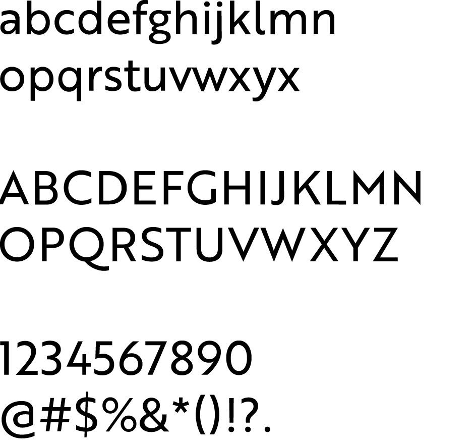
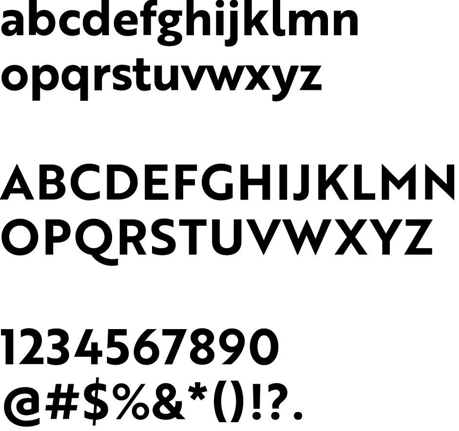
Brother 1816 is the headline typeface for the Village Church Brand Identity. It is a sans serif family of fonts that is part of the Adobe Typekit font library.
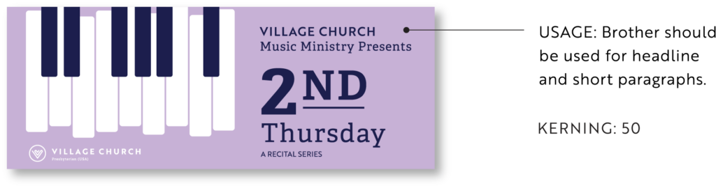
The font is not to be altered in any way (tracking or height reduced, stylized with drop shadows or outlines, skewed or morphed, etc.), and appropriate kerning is to be used. Kerning will be set at 0 for body copy and 50 for headlines and sub-headlines. Use Brother in uppercase for headlines and sentence case for body copy.
REGULAR
BOLD
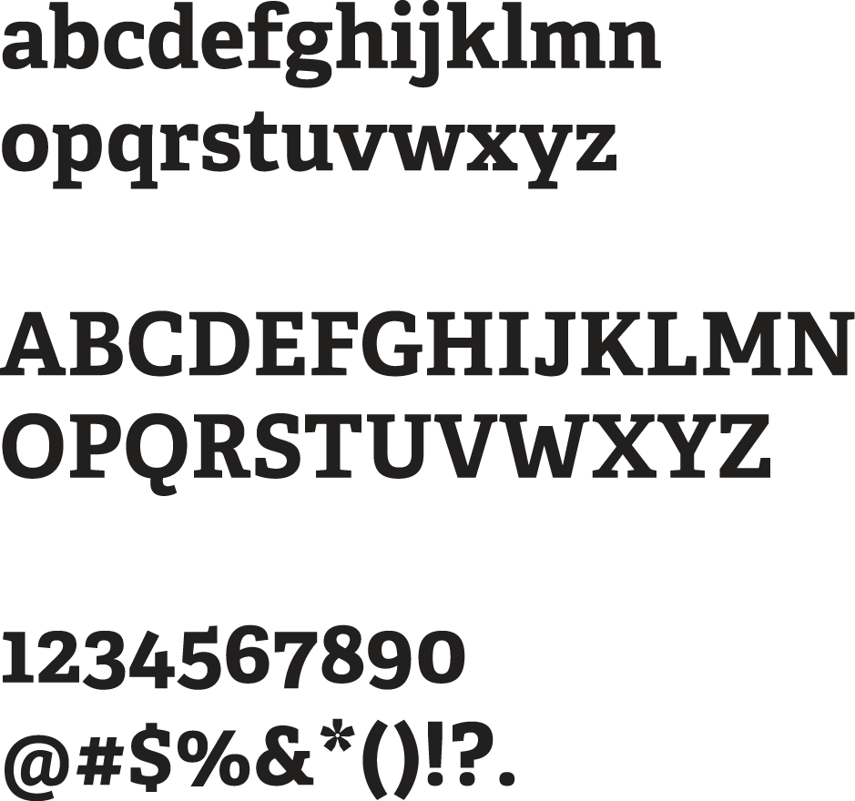
secondary typeface
adelle
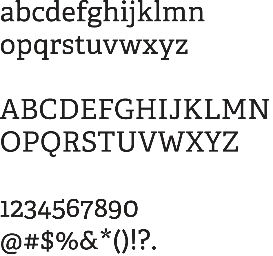
Adelle is the secondary typeface for the Village Church Brand Identity. It is a slab serif family of fonts that is part of the Adobe Typekit font library. Adelle comes in three weights, but we recommend only using regular when paired with the typeface Brother.
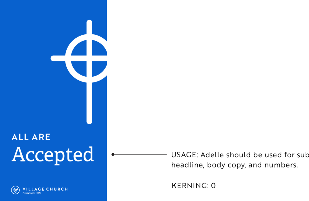
The font is not to be altered in any way (tracking or height reduced, stylized with drop shadows or outlines, skewed or morphed, etc.), and appropriate kerning is to be used. Kerning will be set at 0 in almost every case. Adelle must always be used in sentence case (not uppercase).
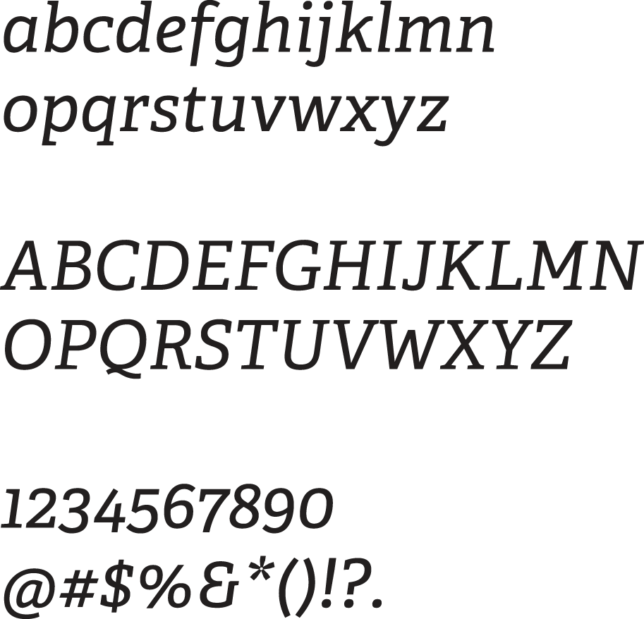
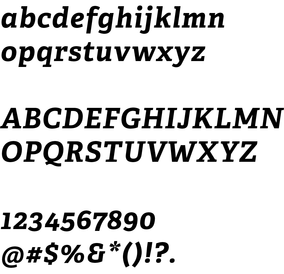
REGULAR
ITALIC
BOLD
BOLD ITALIC
font size
As a general rule, use your own judgment when choosing font sizes for your specific target audience. Due to the wide variance in age and ability among those who call Village Church home, we generally do not use fonts smaller than size 11 point type for body copy in printed materials meant for general church use. Headlines should be the same size or larger.
Large print bulletins and programs are the exception to brand typeface guidelines. Large print materials should be printed in size 16 point font in black ink on white paper to allow for maximum readability. Choose an easy to read sans serif font (Arial or Aptos are good options).