Logos
The Village Church primary logo is the simplest, most immediate, and most recognizable ambassador of the Village brand.
Always remember that the logo needs to appear on all communications, materials, and products. The Presbyterian (USA) identifier needs to appear on all external communication, such as website home page, business cards, letterhead, bulletin, monument sign at Antioch Campus, and Food Pantry truck.
It doesn’t matter how spectacular our communications are if they don’t display our identifiers, because they will afford us little or no credit for our efforts.
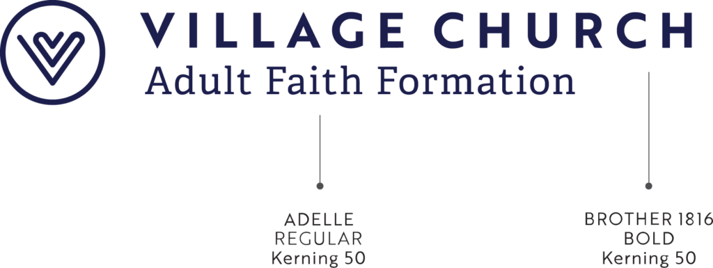
primary logo – with descriptor
The positive Village logo should be used when applied on a light background. The reversed logo is recommended when the logo must be applied on a dark background. Black may only be used when color printing is not possible.
Refer to PMS, RGB, CMYK, or HEX depending on application.
POSITIVE
REVERSED
primary logo – without descriptor
The positive Village logo should be used when applied on a light background. The reversed logo is recommended when the logo must be applied on a dark background. Black may only be used when color printing is not possible. It is important that this version is only used with internal audiences who know Village is a member of the Presbyterian Church (USA) OR if the designation “Presbyterian (USA)” appears elsewhere in the communication.
Refer to PMS, RGB, CMYK, or HEX depending on application.
POSITIVE
REVERSED
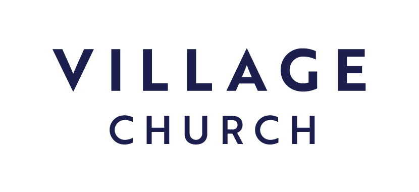
Wordmark
The Village wordmark should be used on applications when space won’t allow for the primary vertical logo to be used at an acceptable size. This version can also be used when the heart mark is used on the same communication in a larger or separate way. It is important that this version is only used with internal audiences who know Village is a member of the Presbyterian Church (USA) OR if the designation “Presbyterian (USA)” appears elsewhere in the communication. Wordmark may only be used in navy, white, or black (black may only be used when color printing is not possible).
POSITIVE
REVERSED

primary logo – with descriptor (horizontal)
The horizontal Village logo should be used on applications when space won’t allow for the primary vertical logo to be used at an acceptable size.
POSITIVE
REVERSED
primary logo – without descriptor (horizontal)
The horizontal Village logo should be used on applications when space won’t allow for the primary vertical logo to be used at an acceptable size. It is important that this version is only used with internal audiences who know Village is a member of the Presbyterian Church (USA) OR if the designation “Presbyterian (USA)” appears elsewhere in the communication.
POSITIVE
REVERSED
brand mark
The Village Church brand mark accompanies the logo and can be locked up with the logo or used on its own.
The positive Village brand mark should be used when applied on a light background. The reversed logo is recommended when the logo must be applied on a dark background. Black may only be used when color printing is not possible.
Refer to PMS, RGB, CMYK, or HEX depending on application.
POSITIVE

REVERSED

informal brand mark
The hand-drawn Village mark is for usage on informal, more light-hearted applications. Use as a design element to further enhance a communication. It may be positive or reversed and used over imagery, as a photo frame, background element, and/or at any transparency, unlike our formal mark. It may also be used in a variety of brand colors. Contact Communications for a custom color.
POSITIVE

REVERSED

FORMAL SUB-BRAND
Use this logo when a specific ministry or program needs to be identified and it can’t be identified in copy with the support of the primary logo.
The positive Village brand mark should be used when applied on a light background. The reversed logo is recommended when the logo must be applied on a dark background.
EXAMPLES
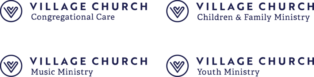
Choose the formal sub-brand logo you need from the list below. If you need a formal sub-brand logo that is not listed, please contact Communications.
informal sub-brand
The logos below are examples of an informal usage of the brand identity. This is for audiences who are familiar with the formal brand for usage on informal communications from a specific ministry. If your ministry is not listed below but would like to make use of this logo format, contact Communications.
logo format overview
minimum size
Minimum sizes for these logos are shown below. Presbyterian (USA) is enlarged when the logo is at 1”. Below these sizes, the logo and copy become difficult to read.
The minimum size version with Presbyterian (USA) designation enlarged is downloadable below. This version is not to be used larger than 1” in size.
proximity zone
The logo must have a clear zone maintained around it at all times. Type, images and other graphics must be placed away from the logo at a distance greater than or equal to (x). See below for reference.
logo do’s and don’ts
RESIZING
Always scale the logo proportionately. Never stretch the logo.
STRUCTURE
The size relationships and spaces between the letters have all been carefully set and should not be altered. Always use the logo as it was designed.
COLOR
Always use the appropriate brand colors.
BACKGROUND
The logo needs to be visible on the background. The logo should not be altered to become visible on a non-contrasting background. Never add drop shadows, a stroke, or a glow to the logo.
The Village positive (navy or black) logo should never be placed on a dark background. Please use the reversed (white) logo instead.